Banner Sizes 2021 – The Most Effective Banners For Your Campaigns
december 5, 2018
One of the most crucial things to consider in the banner creation process for Display Advertising is which sizes to use. The banner size can have a major effect on how ads perform – and the right choice can in fact boost your ad effectiveness.
To help you out we’ve collected data from 4.8 billion ad impressions on millions of sites to bring you the most up to date statistics on banner usage for 2018.
If you want to know which banners are the most commonly used across the web, this guide is for you.
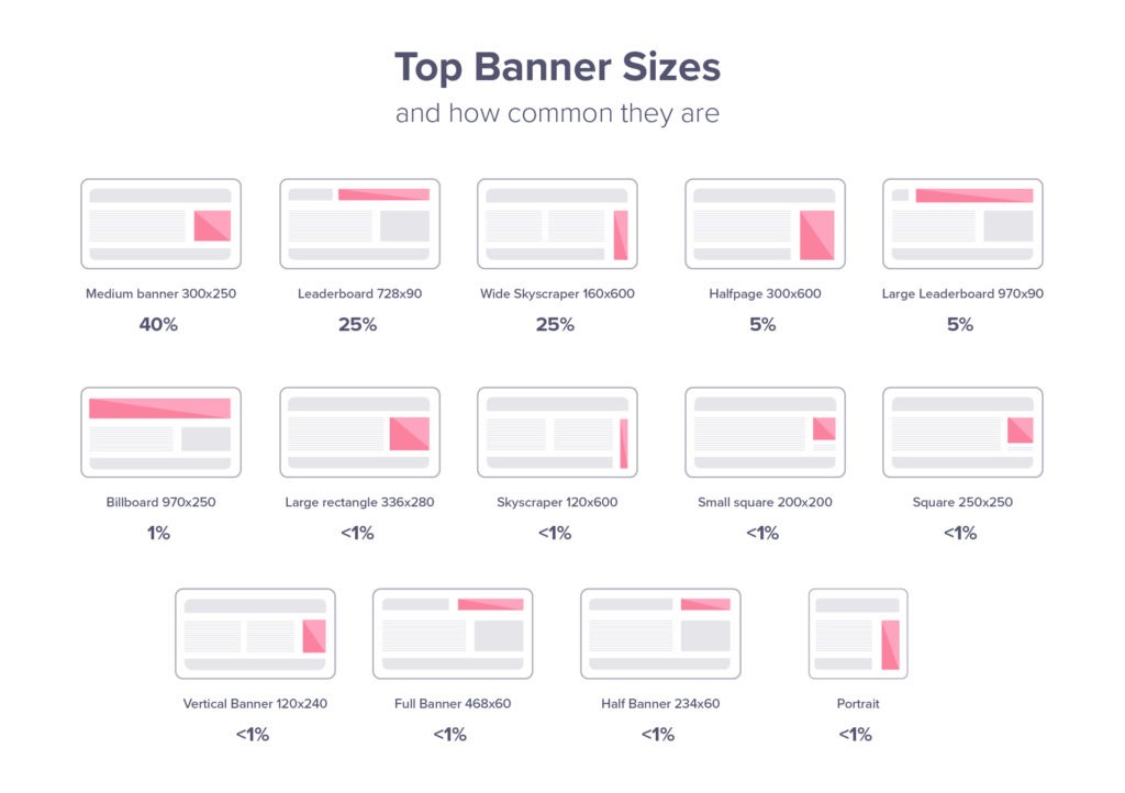
Common Banner Sizes
The Interactive Advertising Bureau (IAB) has created standardized guidelines on banner sizes, which work across all advertising networks, including the Google Display Network (GDN).
If you want to learn more about the different sizes and how common they are, you will find the 15 most important formats in a handy chart below – together with how common they are, to make it easier for you to plan your campaign.
You will also find a specific section for mobile ads below the first table.
Standard Banner Sizes
| Size (Px) | Name | Global Frequency | Weight | Example |
| 300×250 | Medium Rectangle | 40% | < 150kb | 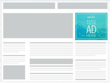 |
| 728×90 | Leaderboard | 25% | < 150kb | 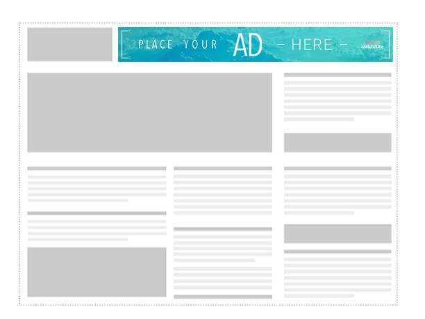 |
| 160×600 | Wide Skyscraper | 12% | < 150kb | 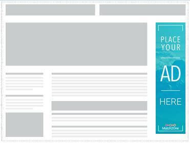 |
| 300×600 | Half Page | 5% | < 150kb | 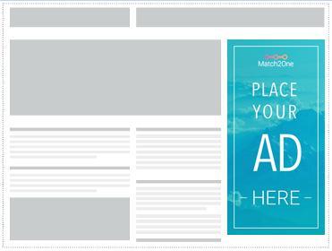 |
| 970×250 | Billboard | 1% | < 150kb | 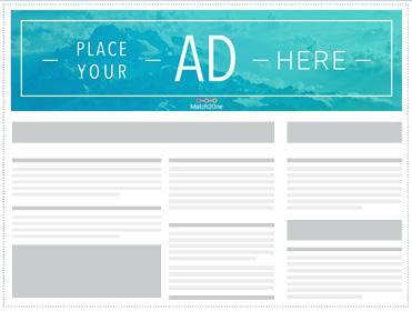 |
| 336×280 | Large Rectangle | <1% | < 150kb |  |
| 468×60 | Banner | <1% | < 150kb | 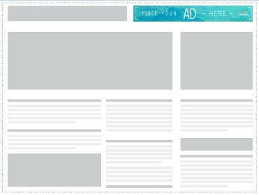 |
| 234×60 | Half Banner | <1% | < 150kb | 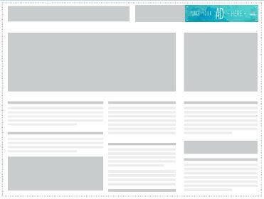 |
| 120×600 | Skyscraper | <1% | < 150kb | 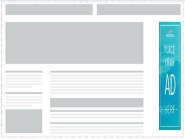 |
| 120×240 | Vertical Banner | <1% | < 150kb | 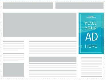 |
| 300×1050 | Portrait | <1% | < 150kb | 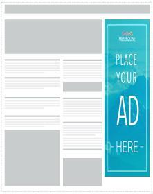 |
| 970×90 | Large Leaderboard | <1% | < 150kb | 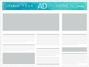 |
| 250×250 | Square | <1% | < 150kb |  |
| 200×200 | Small Square | <1% | < 150kb |  |
| 180×150 | Small Rectangle | <1% | < 150kb |  |
| 125×125 | Button | <1% | < 150kb |
Mobile ads have seen a major upswing in recent years. These are the different banner sizes that work well on mobile:
Mobile Banner Sizes
| Size (Px) | Name | Global Frequency | Weight | Example |
| 320×50 | Mobile Leaderboard | 12% | < 150kb |  |
| 320×320 | Mobile Full Page Flex | 1% | <150kb |  |
| 320×100 | Large Mobile Banner | <1% | < 150kb |  |
| 250×250 | Square | <1% | < 150kb |  |
| 200×200 | Small Square | <1% | < 150kb |  |
As you can tell from this list there’s quite a few sizes to choose from when picking your ads – but the good news is that the absolute majority of impressions are made up of only 4 sizes! Read on to learn more about which banners to focus on in your display advertising.
Which ad sizes are the most popular?
Our research shows that the different banner sizes are very unevenly distributed in their usage, with 4 variations dominating the digital advertising world.
89% of all ad impressions are made up of these 4 sizes:
- 300×250 Medium Rectangle 40%
- 728×90 Leaderboard 25%
- 320×50 Mobile Leaderboard 12%
- 160×600 Wide Skyscraper; 12%
Mapped out the distribution of global ad inventory looks like this:
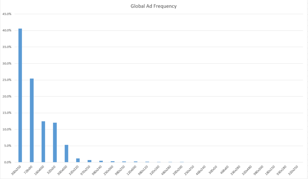
When planning your display campaigns it could be wise to focus on these four sizes.
Mobile Banner statistics
If you haven’t already shifted your advertising efforts to a mobile-first focus it’s definitely a good time to start thinking about it.
Mobile has passed desktop as the main device used for browsing, delivering 61% of all internet traffic in 2020.
Mobile ads can be displayed both when you’re browsing the web but also directly in apps.
Of the different ad sizes available for mobile, one format clearly stands out among the rest; the 320×50 Mobile Leaderboard.
Read on to learn more about this format.
Mobile Leaderboard (320×50)
The 320×50 banner is by far the most widely used ad for mobile, both in browsers and in apps. In fact, our research shows that:
12% of all global ad inventory is made up of the Mobile Leaderboard.
If you want to maximize your ad reach in 2021 we highly recommend having a few of these formats in your inventory.
What does a 320×50 Mobile Leaderboard look like?
Displayed at the bottom of apps and embedded in content it looks like this:
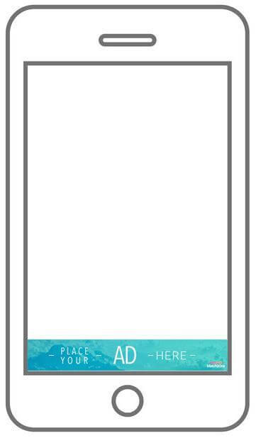
This format is heavily used within apps, often displayed as a banner at the very bottom of the screen.
Here’s an example of in-app usage of the Mobile Leaderboard:
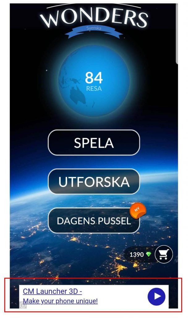
Apps are quickly becoming one of the most common ways people consume content, and if you want to be able to reach potential customers while they’re browsing apps, this is the main format to use.
Another format that works well on both mobile and desktop is the 300×250 Medium Rectangle. This is the most widely used banner size of all global inventory, with 40% of total reach.
Want to know more about this type of ad? Keep reading!
Medium Rectangle Ad (300×250)
No Display Ad campaign is complete without the Medium Rectangle. This standard banner has 40% of global inventory and is by far the most important inventory in your advertising arsenal.
The reason it’s so popular is that it works well on both mobile and desktop.
What does the 300×250 Medium Rectangle Ad look like?
On a desktop setting the Medium Rectangle looks like this:
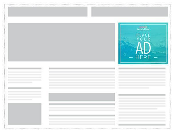
Where is the Medium Rectangle used?
This banner is often embedded in content like text articles. It’s usually perceived as less intrusive than bigger formats.
The Medium Rectangle performs well both as a text version or an image ad.
Here’s an example of an in-content ad that follows the GDN guidelines:

On mobile devices this format acts as a page-break for long pieces of content and if it’s well designed it creates a natural addition to websites that users don’t see as intrusive.
Implementations and best practices of the Medium Rectangle Banner
Because of the unique size and shape of the Medium Rectangle Ad – and it’s widely spread usage, Google has issued specific guidelines for this type of banner.
It’s important to note that if you fail to follow the rules set up by Google they may decide to remove your ad from the Google Display Network, which covers around 2 million websites and reaches up to 90% of all internet users.
If you want to read the full set of guidelines you can find them under the Google AdMob guidance on the Medium Rectangle Ad.
Simplified, the ad guidance for the 300×250 banner dimension look like this
300×250 GDN Policy
- Ad mimicking app content
Ads must be clearly distinguishable from app content
- Ad overlapping with app content
The ads cannot cover the content of the app
- Ad on screens with no content
Don’t place ads on “dead-end”-screens, meaning there must be a way to exit out of the screen without clicking the ad.
- Ad adjacent to interactive elements
Avoid accidental clicks on the banner by not placing it in too close proximity to other interactive parts of an app, like a navigational menu or a chat box.
- Custom close or dismiss buttons
- Close buttons should not overlap or be adjacent to the ad, since this causes a lot of accidental clicks
As a rule of thumb ads should be easily distinguishable from the general app content. If users understand that they’re looking at an ad, you should be in the clear.
The 300×250 banner should definitely be part of your banner inventory – as it works very well on both desktop and mobile, and covers a huge part of global inventory.
The next banner on the list is the 728×90 Leaderboard. With 14% of global inventory this is an important ad to use in your campaigns. Keep reading if you’re interested in learning more about this banner size.
Leaderboard Banner (728×90)
Also known as a Horizontal Banner, this is the 2nd most common ad size among global inventory, with 25% of global impressions. This banner combined with the Medium Rectangle and the Mobile Leaderboard should cover most of your Display Advertising needs.
The 728×90 Leaderboard is part of the IAB standard banner sizes, and works well on the Google Display Network.
What does a 728×90 banner look like?
On a desktop browser the ad is displayed like this:

Where is the Leaderboard Banner used?
The horizontal banner is usually displayed at the very top of websites – but sometimes also shows up at the bottom.
“Above the fold” ads tend to deliver better than banners at the bottom of a page – simply because fewer users scroll all the way to the bottom of a website, and when they get there they may feel like they are already done with the content and are less likely to click on to something else.
Example of a Leaderboard ad
Below is an example of a well designed Leaderboard Banner:

The last types of ads we’ll take a closer look at are the Wide Skyscraper, and the Skyscraper formats. These are not mobile friendly, and their reach is in decline, but are still widely used for desktop browsing.
Wide Skyscraper (160×600)
Sometimes called a Standing Banner, this is the more common of the two Skyscraper banners with 12% of global inventory.
There is a thinner version of this ad, simply called Skyscraper, with the size 120×600 that is aimed at websites that cannot accommodate the Wide Skyscraper, but when choosing between the two, the Wide Skyscraper is your safest bet.
More sites use this banner size than the thinner Skyscraper and it’s placed along the sidebar of a website. About 12% of global ad inventory is made up of the Wide Skyscraper whereas only 0.2% consists of the thinner Skyscraper.
What does a 160×600 banner look like?
The Wide Skyscraper looks like this:
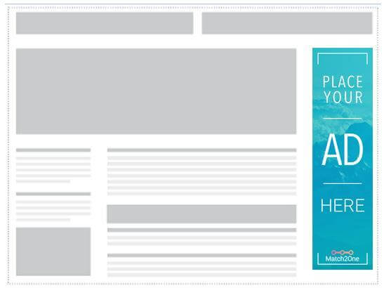
Where is the Wide Skyscraper used?
The Wide Skyscraper is usually used along sidebars on websites and converts well both as text ads and image ads.
Example of a Wide Skyscraper ad
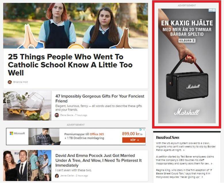
Buzzfeed’s entire business is ad-based and they have perfected the use of display ads in strategic locations. You can find a Wide Skyscraper on the right side of their main page.
As mobile has overtaken desktop as the main device for browsing the Skyscraper is becoming less and less relevant. I still recommend having one in your inventory for desktop and tablet devices, but if you have limited resources for creating banners your focus could be better spent on other formats.
Conclusion
Display advertising is very much alive and well in 2021, and to create a successful campaign you don’t need a huge stable of inventory.
You can successfully cover both your desktop and mobile reach by starting with with 4 varieties of ads, and expand as you start seeing results.
If you focus on these 4 dimensions you’ll cover over 89% of global inventory:
- 300×250 – Medium Rectangle Ad
- 320×50 – Mobile Leaderboard
- 728×90 – Leaderboard Banner
- 160×600 – Wide Skyscraper
It’s important to keep mobile in mind when creating your Display Campaign. The majority of internet traffic nowadays comes from mobile and ads should be created to accommodate this.
The 300×50 Mobile Leaderboard displays well both in apps and in web browsing on mobile, and the Medium Rectangle works on both mobile and desktop.
There are specific guidelines for the Medium Rectangle ad and it’s important to keep these in mind when creating ads for the Google Display Network. The guidelines can be found here.
Now that you know a bit more about banner sizes, it’s time to get creative! The next guide will show you have to get started with our 5 steps to creating the perfect banner. Don’t miss out!
Do you know anyone that could use some help with creating banners? Share this article and maybe you’ll get a cookie!
Do you want to learn more about programmatic advertising? Have a look at our ultimate guide: What is programmatic advertising?
Leave a comment
Du måste vara inloggad för att publicera en kommentar.


107 comments
The article was very useful. Thanks
Thank you for this info it was very helpful
This is a great article to get familiar with the most commonly used advertising formats. i’d be curious to have you guys good practices.
Personnaly I’ve started automating my banner banner production with http://www.abyssale.com and it’s a game changer !!!! 🔥
The article was very useful. Thanks
I really like your blog; it contains tons of useful information. Thank you for sharing it. Kudos.
Great article. !
Awesome Guide. This definitely enhanced the business model our team currently uses. Great Post!
Thank you very much Ola!
Thank you for share this beautifully arranged article for us.
Thank you for sharing. Very helpful site. Please check my website to see…..https://www.egwunutshellblog.com
Thanks for your nice article sir for banner ad sizes..that helped me a lot.
Regards TechNiyojan
Hi.
There is a mistake in your article. First author says about
320×50 – Mobile Leaderboard, then in conclusion the size is different: 300×50.
IMHO the first value is the correct one: 320×50.
Hi Piotr,
You’re right – sharp eyes!
I’ll correct it right away. Thanks for noticing, and thanks for reading all the way to the end 😉
Cheers
Hi, Ola,
I’m managing an website education based content – marketplace for private schools and publisher for parents. It’s a niche platform, but growing organic. We’ve been told by a media agency to sell large formats ads on a high rate CPM, but reading your article it seems that other banner formats offers better results?! 80% of our readers are coming from mobile. First thing first, I need help to shape my advertising inventory – how many banners? what formats? – then to decide if it is good for display? The website is ****, unfortunately only for Romanian readers, but is a good content platform, away from click bate or other editorial OMD to increase our audience. We have a monthly average of 150.000 pages and 75-80.000 unique visitors. I don’t know how can you help or how we can collaborate, but thanks for free good quality content offered to us. All the best, dan
Hi Dan,
Thanks for your nice comments!
The data in the article is based on which inventory is the most common – not necessarily which banners offer the best results. This would more depend on the layout of your website.
Since most of your traffic is from mobile, a good starting point might be the 320×50 Mobile Leaderboard and the 300×250 Medium Rectangle. I suggest having a look at the largest similar sites you can find (both on mobile and desktop) and see which ad formats seem to be the most common. You can be sure they’ve tested the sizes and placements to find the most revenue-driving solution.
We currently don’t offer supply-side services (selling ads), but feel free to reach if you want to advertise your own site to people in Romania. Your amount of traffic should give our AI a good chance to find some highly relevant traffic for you 🙂
Thanks!
/Ola
This is a rich good article. We are a publishing company and we have been searching for materials to learn about advertising on both website and application. After a lot of searching, reading and review, we definitely recommend this article of OLA RASK.
Well done and thank you OLA.
Ali – Kuwait
Thank you Ali – I’m glad the article helped!
Thank you Saikrishna! I’m glad you liked the article – and I’ll do my best to keep producing helpful content 🙂
Thanks for sharing such great Article. You really shared such a useful Information with us which helped me a lot and I have bookmarked your page so that i can get to learn new things each time you share any great Information to us.
Keep up the Good Work!!
Thanks